Friday, August 1, 2014

Junk in my Trunk

No, that's not a reference to my substantial posterior... just a reference to this old trunk I spruced up a really long time ago and am just now deciding to blog about.


My mom inherited a set of military trunks from her godmother years ago.  They belonged to her godmother's father, who was in World War I and had these really cool painted stencils with his name on them.  I believe there were originally a series of 7 numbered trunks.  Now, I think we have 3 of them... not sure what ever happened to the rest.

Here's one of the original ones.  Sorry about the blurry picture... I zoomed in really far.  I use this one as my coffee table.  Just wanted to show you for reference as to what they looked like originally.


Anyway, my mom re-purposed one of these trunks into a toy box for me when I was little.  As was the style in the 80's, wallpaper was 'in' and my room was no exception.  My room was covered in blue and brown Hollie Hobbie.  Remember her?


Well my toy box was not left out of the wallpaper extravaganza, and so was papered to match my bedroom in the coordinating accent wallpaper.  Every inch.  Inside and out.  She went to a lot of trouble papering that thing.  It had to have been a huge pain in the butt.  It was awesome at the time.  Very 80's chic... not to be confused with 'shabby-chic'.  However, after years of sitting in a hot attic, it was just shabby.


You see, I even had some fun of my own personalizing it with my very own monogram....so that no one would be mistaken that everything inside belonged to ME and only ME.  I'm sure I wasn't supposed to be writing with magic marker on my painstakingly wallpapered toy box, but I digress...


The first step in refurbishing this trunk was to get all that wallpaper off.  It wasn't very hard since most of it was coming off of its own accord, so it just took a little pulling and scraping on my part.  What didn't come off by just pulling the corners, I just sprayed with a little warm water and scraped off with my scrape blade.  It came off very easily.


I wanted something that would be light and bright for my living room so that I could lighten things up in there for summer.  I didn't want to stray too far from its original appearance though, so I decided to stencil on the same thing that's on the original set of trunks.

I started with a coat of off-white paint over the entire thing and let that dry, then I did my stenciling. I did the same text as the original trunk: "Lt. Col. E.J. Voltz / Pittsburgh, PA." and since it it was a series, (and since I have no idea which ones we're actually missing...my original one is a No. 7) I decided to make this one No. 4.  For no other reason than I just like the number 4.  I decided to do my stenciling in gray, tan and black.  I figured that would go with just about anything.


Then came the tedious task of stenciling one letter at a time.  And I even did shadow text, so I had to go over it twice.


And then................. realized after it was all finished that I spelled 'Pittsburgh' wrong.  Yeah, it's got an 'h' at the end.  Duh.


Yeah, I didn't realize that until it was already in the house, dressed for success.


I was able to make that correction without too much trouble.  Luckily I had left enough room to add the extra letter without having to change anything else.

Then....... I realized I did the state initials P.A. instead of just PA.  So it reads, "Pittsburgh, Physician's Assistant."  Why is it so hard to see grammatical errors when you're up close and personal, making stencils that are really hard to correct?


My sweet little Bob-cat (#kittyheaven #missthatguysomuch) didn't have any problems with it, so I left it as is and it's still the same now.  I haven't bothered to fix it yet and I did this project months ago.  Maybe I'll get around to it one of these days.

Anyway, it turned out pretty nice overall... minus all the grammatical errors....and it holds a ton of stuff.  Now I have a place for all those old Pottery Barn catalogs, Better Homes & Gardens, and Country Living magazines that I can't bear to part with.  Not to mention a bunch of photos, DVD's and other miscellaneous items that were just taking up space under the bed.  Now that I think on it, I should probably get rid of some of that stuff, but oh well....

I have since switched my living room back to the original trunk / color scheme and this one lives in my bedroom.  My cat loves it and uses it for his own personal napping spot.  It was worth it to be able to keep all that junk in my trunk!  :o)


Tuesday, July 22, 2014

Baby Elephant Rocker

My best friend just had her first baby - it's a boy - he's so cute, cuddly, and fat!  Meet Gary.  He's such a cutie-patootie!  See?  (I get to call him fun little names like that while he's too little to realize what's going on.)


Before he was born, my friend was decorating the nursery (which is super adorable, by the way), and she asked me to make her a copy-cat rocker that she had seen on Pinterest as her baby shower gift.   It was an elephant rocking chair - baby sized.  

Here's a picture of it from Pinterest:


I'm always eager to please, so I immediately turned to Daniel: my go-to, can-make-anything-guy - and asked if he could make one.  He said, "sure, no problem" and so it began.

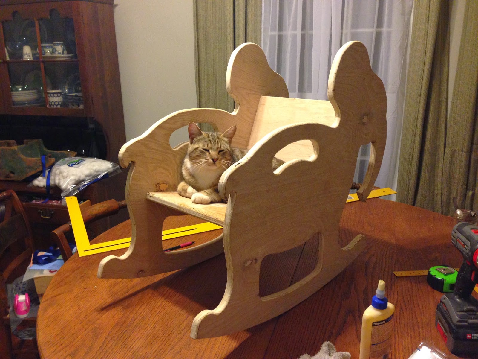
We had some leftover plywood from a previous project, which turned out to be just enough to make this little guy.  He made the pattern, cut out all the pieces with a jig saw and screwed them all together with his pocket hole jig.  It was only 4 pieces total - 2 sides, the back rest, and seat.  I can't take any credit for anything besides a little sanding and painting it once it was all put together.  I also don't really know how to tell you how he put it together... he's the muscle and the brains behind most of my operations... I just put stuff in place and make it look pretty once it's done.

I even put it through quality control inspections.  Leon, my inspector, said he loved it.  Super comfortable and great for napping.


 Leon said it was great for playing games like 'peek-a-boo' as well.


 Unfortunately, he had to relinquish his seat long enough for me to get some paint on it.  It only took 1 sample can of paint from Lowe's Hardware to cover it with 2 full coats.

And here it is, finished up, all decked out in the nursery after Brooke worked her magic on it - complete with a quilt, pillow, and cute stuffed animal.


How adorable is this thing?!  Still not as cute as this handsome little guy!  


"WAHOO!"

"My Baby Elephant Rocker is #1!"

I can just see this guy in a few years, climbing on it, race-rocking, using it as a ladder to climb up on other furniture he's not supposed to be on... the possibilities are endless!  He's definitely going to keep his mama and daddy on their toes!  

The fun thing about this project is that you could customize it to your particular nursery theme.  Just cut out the silhouette of your animal of choice, add a seat and a back, paint, and you've got a sweet, personalized baby rocker of your own!

Tuesday, June 10, 2014

Paper Flower Wreath

I saw this image on Pinterest for a paper dahlia wreath:


 I thought it was beautiful.  So, I decided to try one for myself.  I've been trying to spruce up my front porch and make it a little more welcoming.  We have recently pulled up all the shrubbery from the front of the house in preparation of some new landscaping, so it looks a little barren out there.  I got some fresh new pillows for our bench in a bright turquoise, a new welcome mat from Target, and a couple pots of flowers to brighten things up.


The bench is one that my grandpa made years ago.  It's been sitting outside for years and needs some major work, but for now I'm just calling it 'shabby chic'.


That's our new dog, Odie.  Odie says hi.  He adopted us.  He came up one evening around dusk when I was sitting outside on the front porch.  He trotted up, lay down on my feet, sighed and went to sleep.  It was like he said, "SIGH... Okay, I'm tired of walking so I think I'll live here now."  He's really sweet but had no collar, so we don't know if/who he belonged to.  He gets along with the cat, so that clinched it.  He's a keeper.  He's already spoiled.


Since turquoise seemed to be the main color theme out there, I decided to make my paper wreath in shades of turquoise.

It was really very simple to do, and Love, Pomegranate House has a great tutorial here.

Here's what I personally used for mine:
1 - 8" cardboard cake round;
6 sheets 8.5" x 11" cardstock, cut into fourths, in the darkest shade for the outer row (23 total cones);
2 sheets 12" x 12" cardstock, cut into sixths, in the medium shade for the outside inner row (12 total cones);
2 sheets 12" x 12" cardstock, cut into ninths, in the medium shade for the inner inner row (12 total cones);
2 sheets 12" x 12" cardstock, cut into ninths, in the lightest shade for the inside (21 total cones)
hot glue;
small piece of ribbon for hanging.

Here are the pictures of the process, it's really pretty self-explanatory.


Cut your paper into the sizes listed above, roll each piece into a cone shape, glue and set aside.  Then smash the ends together and glue those onto your cardboard round.


Keep layering until the round is completely covered and you have a flower.


Ta da!  That's it.  Pretty simple right?  It was a little time consuming, but not bad at all.  I'd say the whole process took me about 30-45 minutes.


Here's a shot of how it looks from behind.


And to hang, I just hot glued a little loop of ribbon onto the back.


And voila, you have a paper dahlia wreath.


It was so simple and I liked it so well, I decided to make a second one for my back door!  Pretty, huh?


I'll keep you posted on how they hold up over time.  Thanks for stopping by!


Monday, June 9, 2014

Bathroom Reveal

At long last, the time has finally come... to REVEAL THE BATHROOM.  That was actually the heading on our wedding invitations (minus the bathroom part) and believe me, the completion of this bathroom feels almost as momentous.  This simple, "phase 1" project has been coming together since August - that's right, AUGUST - of 2013.  Imagine living in a constant state of chaos for that long!  Cray cray, I know!

We actually had a family get-together this past weekend so they got to preview this space already.  (Sorry family, this is old news for you.) It's amazing how having a bunch of people over seems to light that fire under you to get all your projects finished, get your house cleaned, your yard projects done, etc. etc.  I need to have those more often.

Anyhoo, without further ado, here she is: [cue the choirs of angels singing here]

 My gorgeous mirror... you can see where she started here.

My sconces are from Home Depot, and the faucet is from Wal-Mart.


My pretty, upcycled washstands with their pretty blue glass knobs... you can see where they started here.

Remember when all we had here was a tiny access hole with Daniel's legs hanging out?  Well, it's now bigger and a lot more sleek.


 For the frame in the pic above, I just took a little swatch of my curtain fabric and framed it in a frame I already had on hand.


My homemade curtain... I made this basically the same way I made my kitchen curtains (that tutorial can be found here) and simply added the 3 folds at the bottom, holding the folds in place with straight pins.  They're clearly not perfect, but much better than looking at our ugly, cracked window.
  
  Daniel made the floating shelves for me here for extra storage, and the artwork is one I painted in college, complete with a white duct tape 'mat' and spray-painted white frame.


  This is just a detail shot of my pretty shell container, purchased at Kirklands for $6, which holds extra razors, and the fabric wrapped box (a lightbulb box wrapped in leftover curtain fabric for extra height and interest).

Now that you've seen it all, let's take a look back at where we started.

Before:


SketchUp idea:

After:

Before:

After:
 

Before:

After:
 Daniel's favorite part of the bathroom - all the details that most people don't notice - like the fine woodwork and trim work that he did in here.  I have to brag on him, everything is so well made and he is a perfectionist so he won't let it be until it's perfect!

Before:

After:
You can really tell in this picture how much space we gained around the sink area.  The pedestal sink and washstands are significantly less deep than the original counter.  It was a pretty tight squeeze before.

Before:

Sketch-up Idea:

After:

Well, I hope you enjoyed my bathroom tour!  I know I am enjoying the end result!  It's been a long time coming!  Sometimes I just stand in the doorway and stare at it, grinning like an idiot.  Renovations have that effect on me. :o)


Note: To see all our bathroom posts, progress, etc., click here, here, here, and here.